Building Layouts for Android 🤖

Basic rules
View binding
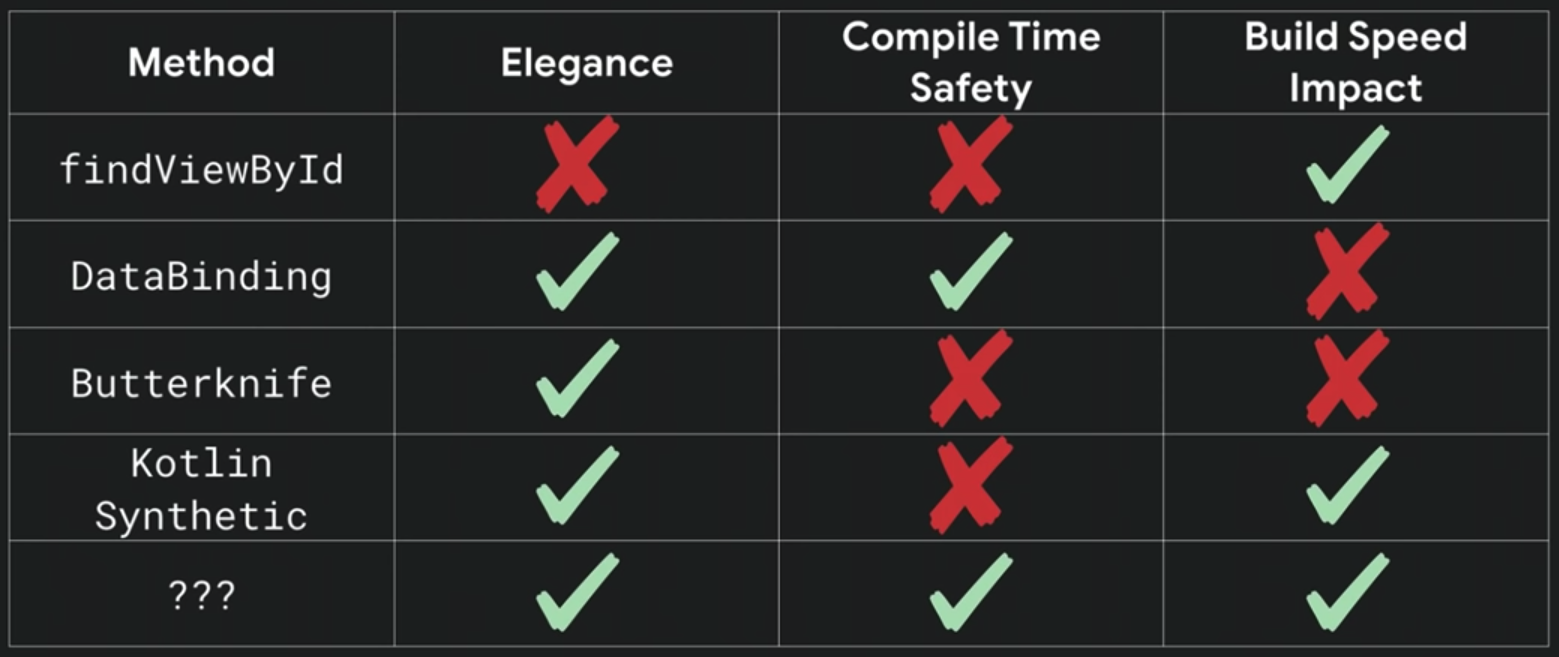
Kotlin Android Extensions (Synthetics)
Synthetics enables effortlessly retrieving views from Activities, Fragments, and Views. The plugin generates additional code, granting developers access to views in the layout XML as if they were properties named after the corresponding IDs used in the layout definition. Additionally, it constructs a local view cache. For further information, refer to this link.
import kotlinx.android.synthetic.main.activity_main.*

override fun onCreate(savedInstanceState: Bundle?) {
    super.onCreate(savedInstanceState)
    setContentView(R.layout.activity_main)

    // tvWelcomeMessage is the id of the UI component
    tvWelcomeMessage.text = "Hello Kotlin!"
}
View layouts
There are a few commonly used layouts which are the LinearLayout, RelativeLayout, and FrameLayout. Most of what can be done in LinearLayout and RelativeLayout can now, and should, be done with a new layout system called ConstraintLayout.
Margin / padding
Utilizing margin and padding values for views facilitate the arrangement and spacing of elements within a layout. For additional insights, visit this link.
- Margin defines the amount of space around the outside of a view
- Padding defines the amount of space around the contents or children of a view.
<LinearLayout>
   <TextView android:layout_margin="5dp" android:padding="5dp">
   <Button layout_marginBottom="5dp">
</LinearLayout>
Resources naming
Basic principle

-
<WHAT>indicates what the resource actually represents; often a standard Android view class. Limited options per resource type. -
<WHERE>describes where it logically belongs in the app. Resources used in multiple screens usegeneral, all others use the custom part of the Android view subclass they are in. -
<DESCRIPTION>differentiates multiple elements in one screen. -
<SIZE>either a precise size or size bucket; optionally used for drawables and dimensions.
Layouts
Layouts are relatively simple, as there are usually only a few layouts per screen.
Where <WHAT> is one of the following:
-
activity_main: content view of theMainActivity -
fragment_article_detail: view for theArticleDetailFragment -
view_menu: layout inflated by custom view classMenuView -
item_article: list item inArticleRecyclerView -
layout_actionbar_backbutton: layout for an action bar with a back button. That kind of layouts is usually used for<include>and<merge>attributes, and hence are reusable.
Strings
The <WHAT> part for Strings is irrelevant, so use <WHERE> to indicate where the string will be used:
-
article_detail_title: title ofArticleDetailFragment -
feedback_explanation: feedback explanation inFeedbackFragment -
feedback_name_hint: hint of name field inFeedbackFragment -
general_done: genericdonestring
<WHERE> obviously is the same for all resources in the same view.
Drawables
The <WHAT> part for Drawables is the type such as:
-
icfor icon -
bgfor background -
fgfor foreground -
placeholderfor placeholder
<WHERE> is used to indicate where the drawable will be used:
Optionally add a <SIZE> argument, which can be an actual size 24dp or a size qualifier small.
-
placeholder_article_detail: placeholder inArticleDetailFragment -
bg_article_detail_banner: background for the banner in article detail -
ic_general_info: generic info icon -
ic_general_info_large: large version of generic info icon -
ic_general_info_24dp:24dpversion of generic info icon
IDs
For IDs, <WHAT> is the class name of the xml element it belongs to. Next is the screen the ID is in, followed by an optional description to distinguish similar elements in one screen.
However, because IDs are often referenced in the code, they follow the CamelCase naming convention.
-
tlMain->TabLayoutinMainActivity -
ivMenuProfile-> profile image in customMenuView -
tvArticleDetailTitle-> titleTextViewinArticleDetailFragment
Dimensions
Apps should only define a limited set of dimensions, which are constantly reused. This makes most dimensions general by default.
Note that this list only contains the most used <WHAT>s. Other dimensions qualifiers like: rotation, scale, etc. are usually only used in drawables and as such less reused.
-
toolbar_height: height of all toolbars -
listitem_keyline_text: listitem text is aligned at this keyline -
text_medium: medium size of all text -
menu_icon_size: size of icons in menu -
menu_profile_image_height: height of profile image in menu
XML Attribute Ordering
Where appropriate, XML attributes should appear in the following order:
* `style` attribute (if there is)
* `id` attribute
* `layout_*` attributes
* style attributes such as `gravity` or `textColor`
* value attributes such as `text` or `src`
Within each of these groups, the attributes should be ordered alphabetically.
Best practices
Drawable or Bitmap?
-
Bitmap actually refers to the images like webp, png, jpg, etc.
-
Drawable is something that can be drawn like a layout, vector, image, etc.
-
Use shapes and selectors instead of images as much as possible.
Make the project lightweight by drawing basic shapes with XML instead of using images. Almost all basic shapes can be drawn with
Shape Drawables. The best part about vectors is that they render neatly in various display densities. This further reduces APK size.Basic shapes and gradients can easily be drawn using the
<shape />tag without the use of images. The resulting shapes that are drawn are always sharp and do not need to be created for multiple densities.The
<selector />tag can be used to add different visual states (likepressed,disabled,checked) to Views. -
Apply Nine-Patch Image for
StretchablebackgroundsTo use an image as background for content where the length of the content is dynamic (e.g.,
Chat Bubble,Custom Pop Up), create aNine-Patchimage to define the stretchable region inside it. TheNine-Patchcan be created with any photo editing tool or the SDK.
Layouts
-
Reusable XML
Write XML Layouts as reusable layouts, which will avoid duplicating the same layout with different names. Use the
<include>,<fragment>and<merge>tags for achieving this.There are sometimes cases where complex views are rarely used. For example, it could be a view only visible depending on a specific condition. In such a case, use a
ViewStubelement. It is a lightweight view with no dimensions and cheap to inflate and leave in a view hierarchy.<ViewStub android:id="@+id/stub_import" android:inflatedId="@+id/panel_import" android:layout="@layout/progress_overlay" android:layout_width="match_parent" android:layout_height="wrap_content" android:layout_gravity="bottom" /> -
Avoid Weight
Playing around with
LinearLayoutandweightis pretty easy, but it makes the layout expensive performance-wise. Avoid usingweightis recommended. -
Avoid Nested Layouts
Nesting layouts to deeper level decreases the layout performance. Avoid nested layouts and nested weights.
Many developers use nested structure with
LinearLayoutfor setting the visibility dynamically. InLinearLayout, the components are arranged in a linear way, so hiding one component will not affect alignment of the rest of the components. -
Improving and designing high-performance layouts
The
ViewGroupthat is used in the layout matters the performance; if the layout hierarchy is too complex, it can cause performance problems when running an Android app. For more insight, visit this link.Whenever possible, always favour the
ConstraintLayout. As opposed to the other container layouts, theConstraintLayoutoffers much-improved performance while still offering similar layout control. Prefer layouts with shallow and wide hierarchy, rather than narrow and deep hierarchy. -
Support for screens with different form factors
Since a wide range of devices is running different OS versions, screen sizes, and densities, consider supporting as much as types of devices.
Styling
-
Separate layout and styling elements
Separate the layout and its styling elements, such as
dimens,strings, andcolors, to maintain flexibility in the layout to work seamlessly on different screen sizes. Additionally, specify a new set ofdimensfor tablets by applyingqualifiers. -
Also keep dimens.xml DRY, define generic constants
When the only thing that changes within a color’s definition is the alpha value, the naming convention is then to append that value at the end of the color’s name, e.g.
    <color name="black_26">#42000000</color>
    <color name="black_40">#66000000</color>
    <color name="black_73">#BA000000</color>
Cheat sheet: https://gist.github.com/lopspower/03fb1cc0ac9f32ef38f4
When adding a new color resource, check the existing colors if it’s available already or not to improve reusability and reduce duplication. So, whenever two different color codes look similar to each other, there might be a chance that they’re actually one and the same. To confirm this, make use of: https://www.htmlcsscolor.com/, e.g.
    <color name="black_nero">#1A1A1A</color>
    <color name="green_lime">#3AC538</color>
Others
-
Accessing Resources: Load app resources in code (via generated R class) and in XML (via @color, @drawable, @string, etc). Do NOT use global extensions or variables to repeat defining app resources for re-using.
val Context.mediumPadding: Int
    get() = resources.getDimensionPixelSize(R.dimen.medium_padding)

class SomeClass {

  private fun sampleMethod() {
    view.setPadding(context.mediumPadding, 0, 0, 0)
  }
}
class SomeClass { private val mediumPadding by lazy { resources.getDimensionPixelSize(R.dimen.medium_padding) } private fun sampleMethodA() { val largePadding = context.resources.getDimensionPixelSize(R.dimen.large_padding) viewA.setPadding(mediumPadding, largePadding, 0, 0) } private fun sampleMethodB() { viewB.setPadding(mediumPadding, 0, 0, 0) } } -
Run the lint tool on layout files to search for possible view hierarchy optimisations.
-
Reuse code in different projects by generic naming
-
Third-party libraries
There are many
third-party librariesfor Android to build elegant layouts. Several of them are must have libraries that are extremely popular and are often used in almost any Android project. Each has different purposes but all of them make life as a developer much more pleasant. The major libraries are listed below in a few categories. Learn moreParis allows defining and applying styles programmatically to Android views, including custom attributes.