Design Review

Reviewing the Wireframes and UI
The team’s design review process is comprehensive and ensures that:
- The UX/UI follows the project brief and vision,
- The elements designed are technically feasible (and complex elements are identified early on),
- The client is happy with the UX, look, and feel of the product.
What to Review, and When
Remember the UX/UI flow illustration in the “Design Process” section? The design review flow is a part of it (hereafter in red).
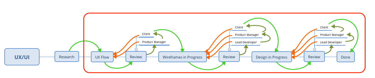
Here is a breakdown of what exactly needs to be reviewed (and what shouldn’t) at each review step.
- UX Flow: the UX flow itself. Not that there is anything else to review…
-
Wireframes: arguably the most difficult review step (for the client especially). The focus of the review must be the User Experience exclusively.
Comment on layout, elements position, sizes/proportions, and user flow.Comment on colors, typography, copy, and style in general. -
Design/UI: the focus during UI review is on the visual appeal and the feel of the product.
Comment on colors, typography, shapes, illustrations, and style in general (and typos).Comment on content, and that's about it. Everything else should be as close to perfection as possible.
Commenting
The commenting phase for both UX and UI is critical. It is where the client can share his opinions and point out the things that are wrong, unadapted, or that (s)he simply doesn’t like.
However, if not properly regulated, the commenting phase can also become messy and a source of frustration for designers.
First of all, the commenting period is not a time for (the following list is not exhaustive):
- Introducing new ideas (this should be done via the proper channels)
- Sharing content
- Asking for changes in the scope of the project
The commenting phase is meant to:
- Identify mistakes (forgotten elements, typos, flaws in the UX, etc.)
- Point out details that aren’t right (for whatever reason)
- Express opinions on typography and colors (during the UI phase only)
Who Should Comment
Client
To keep the comments focused and consistent, only one person should be commenting on the client-side. More than one commenter usually ends up in confused and sometimes contradictory comments. It also opens up the door to client-side debates which should be internal to the client’s team and not done on Figma.
Having more than one commenter on the client team always creates bottlenecks and slows down the iteration process, which can be frustrating for the designers.
Nimble
On the team side, multiple people can (and should) comment:
- The Team Lead (during technical reviews of the UX/UI)
- The Product Manager (after the technical review)
- Optionally another team member for a second opinion and typos check
Actionable vs. Non-actionable Comment
There are actionable, useful comments, and non-actionable, unproductive ones. Writing actionable comments is important. Otherwise, a lot of back-and-forth between the client and the designer will take place. Again, this slows down the process and frustrates the designers.
Example of a Non-actionable Comment
A non-actionable comment is vague, without opinions or explanations when necessary, and generally doesn’t give any real indication as to how to fix the problem.
I don’t like this.
This comment gives no information whatsoever about the reasons why the commenter doesn’t like it or what would be a better alternative.
Example of an Actionable Comment
An actionable comment is straight to the point, accurate, detailed, and gives concrete data/examples when possible.
This button has a different color than all other buttons in the UI. We should keep buttons consistent and have them all of the same green color.
This comment is clear and detailed. The designer doesn’t have to second-guess what it means or ask simple questions to the client.
Processing Comments
Once the designer understands the comment and acts upon it (and updates the design), (s)he must comment back with fixed.
From there on, the Team Lead or the Product Manager (depending on who left the comment initially) must review the changes and mark the comment as “Resolved” in Figma if the changes are satisfactory.
Dealing with Non-actionable Comments
When a client leaves a non-actionable comment (it will happen), start with these three steps:
- Take a deep breath,
- Step away for a minute,
- Come back and reread the comment.
Only then should an individual be ready to process the comment and turn it into something actionable.
To turn this non-constructive comment into a useful one:
- Try and read between the lines (if possible)
- Reply back and:
- Explain, in a polite manner, why the comment is not actionable
- Give a brief tip on how to write an actionable comment
- Ask questions to guide the stakeholder into giving good information. For example:
- Which element exactly are you referring to? (In case it’s not clear, poorly positioned comment on Figma)
- What part exactly do you not like?
- We can change this color if you don’t like it. What color would you like to see instead?
- If you feel that this is too small/big, how much bigger/smaller do you think it should be? 2 times bigger/smaller? 3 times?
- Etc.
The idea is to force the client to be accurate in his/her comments. Here is an example of a good reply:
Unfortunately, I won’t be able to make changes based on this comment. It is too generic, and I can’t fully understand what you’d like instead.
To get the changes that you want, do not hesitate to leave very detailed comments and be as accurate as possible. Regarding this particular remark, could you please let me know:
- What part exactly do you not like?
- If you feel that this is too small/big, how much bigger/smaller do you think it should be? 2 times bigger/smaller? 3 times?