Design Tools

From wireframes to high-fidelity prototypes, all design work happens in Figma. This collaborative tool is used by the designer, the product manager, the lead developer and the client.
Project Structure
Components, UI (with UX flow), Prototype, illustration, should all be separate file on Figma. Within each file, the screens must be organized in pages, where a page corresponds to one particular feature of the application.

At a high-level, the team works with:
- Components, which are UI elements that can be reused across the design projects (for instance buttons, inputs, system messages, etc).
- Pages, which contain all the mockup of a feature.
- Prototypes, which helps bringing designs to life by creating interactions between pages & elements.
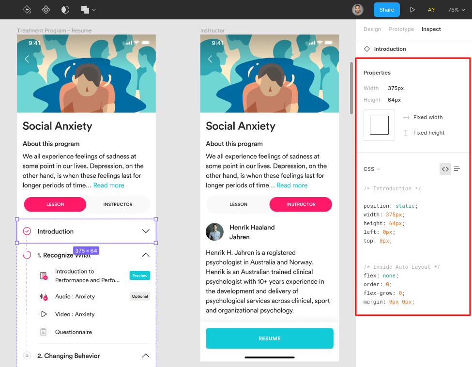
Inspecting Elements
To facilitate the transition between design and development, Figma has a built-in inspect feature. This conveniently provides information about dimensions, typography and the matching CSS styling.

Exporting Assets
Once the client approved the entire design, the designer needs to export the assets (icons, images, etc.) so that the developers can implement them in the final product.
Before exporting assets, the designer should check which format is best for the Lead Developer. The format will also depend on the platform the application is developed for. However, some standards can be applied in most scenarios.
Web
For a web application, the best export format is often SVG.
Android
Android devices cover a wide array of screen sizes and densities. Hence, a set of six different densities is what usually works best:
- LDPI (low) ~120dpi (@0.75x)
- MDPI (medium) ~160dpi (@1x)
- HDPI (high) ~240dpi (@1.5x)
- XHDPI (extra-high) ~320dpi (@2x)
- XXHDPI (extra-extra-high) ~480dpi (@3x)
- XXXHDPI (extra-extra-extra-high) ~640dpi (@4x)
In addition to the density, the assets’ size matter.
To avoid non-integer sizes, which may lead to imprecise implementation, better to stick to multiples of 4. Example:
- 18x18 (@0.75x)
- 24x24 (@1x)
- 36x36 (@1.5x)
- 48x48(@2x)
iOS
Because Apple has a tighter control on its hardware ecosystem, there are fewer screen sizes to worry about when exporting.
Designers should export assets to @1x, @2x, and @3x.