
Apple releases iOS14 with Home Screen Widget support. Now the developer can put a tiny part of their app right on the Home Screen.
In this post, we will be creating a Widget for an eCommerce application. The widget will suggest the best deal of the day and the user can open the product’s detail right from the Widget.
Widget Extension
Let’s begin by creating an iOS empty project. Make sure the Deployment Target is 14.0 or above
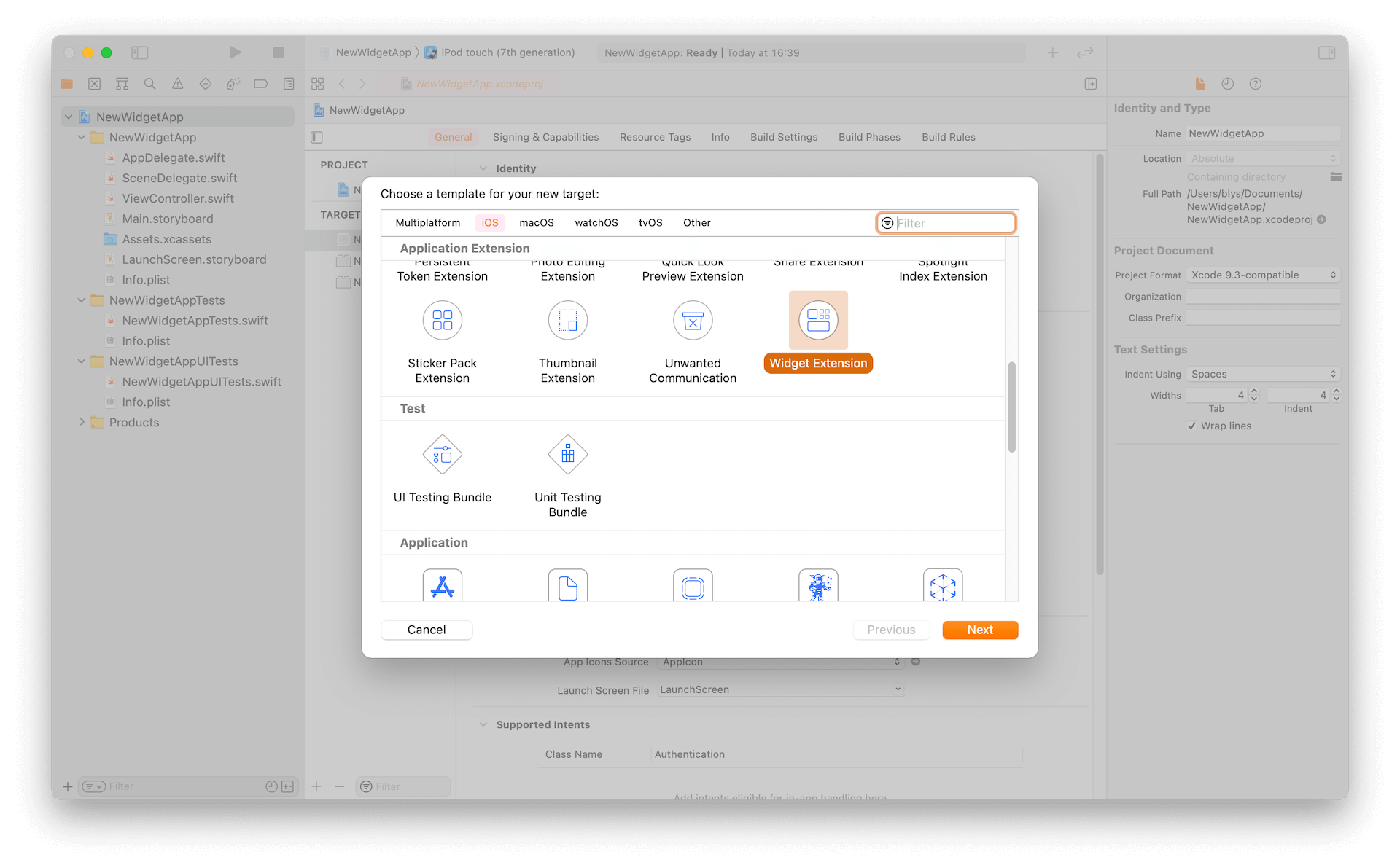
Go to File > New > Target to create an extension to the project.
Select Widget Extension. Select the current project for Project and current app for Embed in Application.
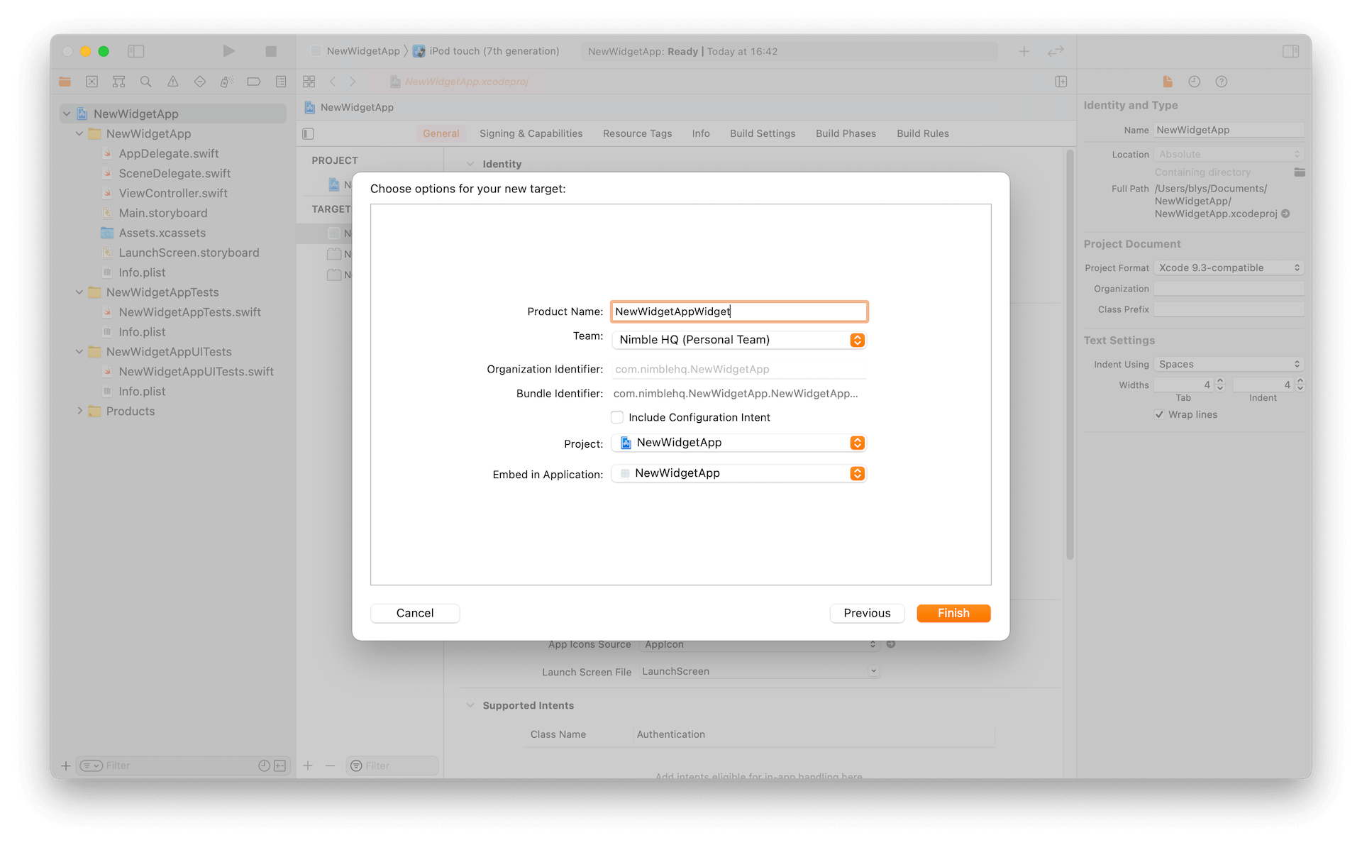
Select Activate when prompted for debugging capability.
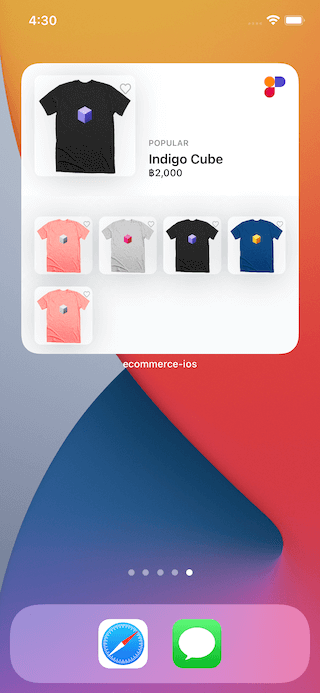
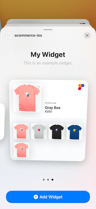
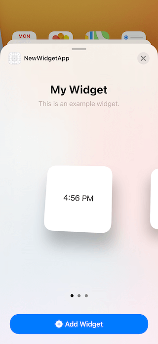
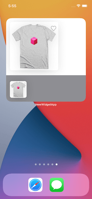
Hit cmd+R and notice we can add Widget to our Home Screen successfully.
Custom Views
Next, let’s create views that we will be using.
import WidgetKit
import SwiftUI
struct ItemViewModel: Identifiable {
let id: Int
let name: String
let imageString: String
static var placeholder: ItemViewModel {
ItemViewModel(
id: 0,
name: "Name",
imageString: "tshirt-cube-pink"
)
}
}
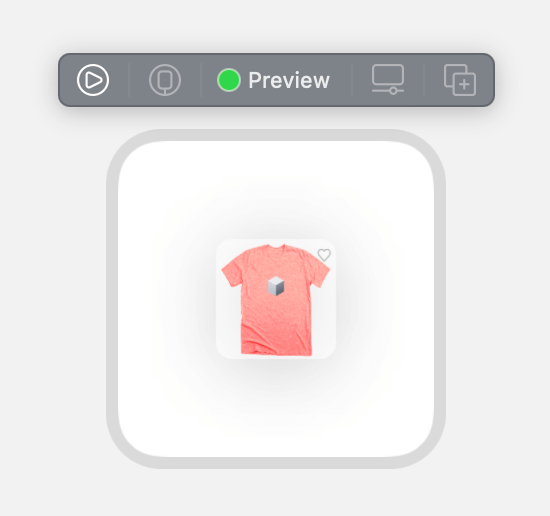
struct ItemView: View {
var item: ItemViewModel
var body: some View {
Image(item.imageString)
.resizable()
.background(Color(UIColor.systemBackground))
.cornerRadius(8.0)
.shadow(
color: Color(UIColor.label).opacity(0.12),
radius: 20.0,
x: CGFloat(0.0),
y: CGFloat(4.0)
)
}
}
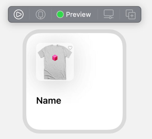
struct ItemView_Previews: PreviewProvider {
static var previews: some View {
ItemView(item: .placeholder)
.previewContext(WidgetPreviewContext(family: .systemSmall))
.frame(width: 60.0, height: 60.0, alignment: .topLeading)
}
}
Also, download these shirt images our designer came up with so we have assets to show in our app.
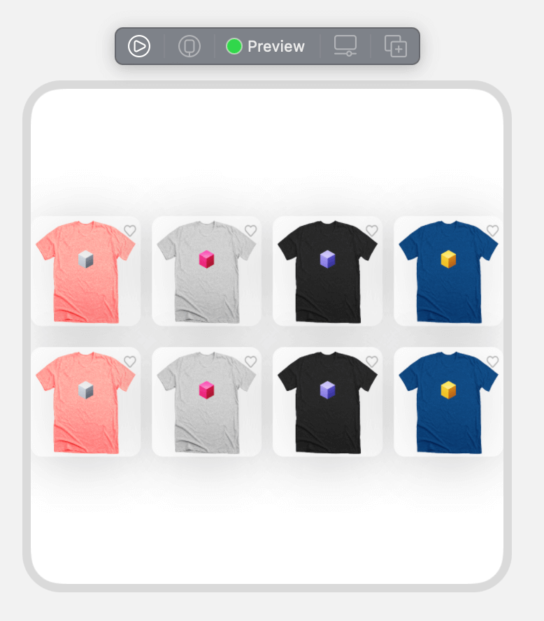
Next, create another view to be our grid-like container.
import WidgetKit
import SwiftUI

struct ItemsGridView: View {

    var items: [ItemViewModel]

    let columns = Array(repeating: GridItem(.flexible()), count: 4)

    var body: some View {
        LazyVGrid(columns: columns, spacing: 15.0) {
            ForEach(items) { item in
                ItemView(item: item)
                    .aspectRatio(1.0, contentMode: .fit)
            }
        }
    }
}

struct ItemsGridView_Previews: PreviewProvider {

    static var previews: some View {
        ItemsGridView(items: [ItemViewModel.placeholder])
            .previewContext(WidgetPreviewContext(family: .systemLarge))
    }
}
We are making a grid with 4 columns of equal size. The size will change depending on the size of the parent’s view and not the number of the items.
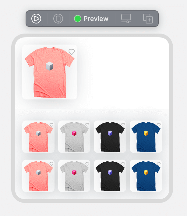
We now have enough views to create a Large Widget view.
import SwiftUI
import WidgetKit

struct LargeWidgetView: View {

    let mainItemViewModel: ItemViewModel
    let itemViewModels: [ItemViewModel]

    var body: some View {
        VStack(alignment: .leading, spacing: 0.0) {
            ItemView(item: mainItemViewModel)
                .aspectRatio(1.0, contentMode: .fit)
                .padding([.horizontal, .top], 16.0)
                .padding(.bottom, 21.0)
            ItemsGridView(items: itemViewModels)
                .frame(maxWidth: .infinity)
                .padding([.horizontal, .bottom], 16.0)
                .padding(.top, 25.0)
                .background(Color.gray4)
        }
    }
}

struct LargeWidgetView_Previews: PreviewProvider {

    static var previews: some View {
        LargeWidgetView(
            mainItemViewModel: .placeholder,
            itemViewModels: [ItemViewModel.placeholder]
        )
        .previewContext(WidgetPreviewContext(family: .systemLarge))
    }
}
To apply this new view to our widget, go to NewWidgetAppWidget.swift and replace the line
struct NewWidgetAppWidgetEntryView : View {
    var entry: Provider.Entry

    var body: some View {
        Text(entry.date, style: .time)
    }
}
With
struct NewWidgetAppWidgetEntryView : View {
    var entry: Provider.Entry

    var body: some View {
        LargeWidgetView(
            mainItemViewModel: .placeholder,
            itemViewModels: [ItemViewModel.placeholder]
        )
    }
}
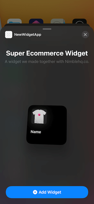
Run the app and try to add a new Widget with the views that we just made hurray 🎉
Adapting to Sizes
If you tried to insert Widget with size small or medium, you’ll see that the layout is not so pretty. We can use @Environment(\.widgetFamily) to determine which view to use for each size.
Modify the variable var body within the struct struct NewWidgetAppWidgetEntryView : View with
var body: some View {
    switch family {
    case .systemSmall, .systemMedium:
        Text(entry.date, style: .time)
    case .systemLarge:
        LargeWidgetView(
            mainItemViewModel: .placeholder,
            itemViewModels: [ItemViewModel.placeholder]
        )
    }
}
Also, let’s create a view for a small Widget
struct SmallWidgetView: View {

    var viewModel: ItemViewModel

    var body: some View {
        VStack {
            HStack {
                ItemView(item: viewModel)
                    .frame(width: 62.0, height: 62.0)
                Spacer()
            }
            Spacer(minLength: 8.5)
            VStack(alignment: .leading) {
                Text(viewModel.name)
                    .font(.system(size: 15.0, weight: .semibold))
            }
            .frame(maxWidth: .infinity, alignment: .leading)
            Spacer()
        }
        .padding()
    }
}

struct SmallWidgetView_Previews: PreviewProvider {

    static var previews: some View {
        SmallWidgetView(viewModel: .placeholder)
            .previewContext(WidgetPreviewContext(family: .systemSmall))
    }
}
Now, our Widget will have a better layout for all sizes.
Widget Lifecycle
It is a good time we look at Widget Extension on a deeper level.
Timeline Entry
struct SimpleEntry: TimelineEntry {
    let date: Date
}
This object contains the data for the Widget at a particular point in time. Widget will react to the Date data in the entries it has and update the UI accordingly.
Widget Configuration
var body: some WidgetConfiguration {
    StaticConfiguration(kind: kind, provider: Provider()) { entry in
        NewWidgetAppWidgetEntryView(entry: entry)
    }
    .configurationDisplayName("Super Ecommerce Widget")
    .description("A widget we made together with Nimblehq.co.")
    .supportedFamilies([.systemSmall])
}
This is the configuration of the Widget, here we can change the name and description shown to users, along with limiting the size available for this Widget.
Timeline Provider
struct Provider: TimelineProvider {
    func placeholder(in context: Context) -> SimpleEntry {
        SimpleEntry(date: Date())
    }

    func getSnapshot(in context: Context, completion: @escaping (SimpleEntry) -> ()) {
        let entry = SimpleEntry(date: Date())
        completion(entry)
    }

    func getTimeline(in context: Context, completion: @escaping (Timeline<Entry>) -> ()) {
        var entries: [SimpleEntry] = []

        // Generate a timeline consisting of five entries an hour apart, starting from the current date.
        let currentDate = Date()
        for hourOffset in 0 ..< 5 {
            let entryDate = Calendar.current.date(byAdding: .hour, value: hourOffset, to: currentDate)!
            let entry = SimpleEntry(date: entryDate)
            entries.append(entry)
        }

        let timeline = Timeline(entries: entries, policy: .atEnd)
        completion(timeline)
    }
}
The TimelineProvider is the source of data for the Widget. It provides data with an asynchronous callback and can provide data in an array of Date along with the update policy.
The TimelineProvider has three mandatory methods:
-
placeholder(in context: Context)
Returns a
TimelineEntryobject to display the Widget. The object will be shown on theSwiftUIViewin a placeholder state. This call is the only one with synchronize return. -
getSnapshot(in context: Context…)
This
donecallback will provide the data for Widget in Snapshot state. An example of a Snapshot state is when the user is looking at the Widget when they are adding them from the catalog. These methods allow asynchronous callback and it is possible to fetch data from the network or database. -
getTimeline(in context: Context…)
This callback send the object
Timelinewhich consisted of-
Entries:
An array of
TimeLineEntryobjects contains the data and theDatewhich determines the order of the entry. In our Widget, we create 5 entries with hour apart so the Widget will have 5 hour worth of future data when the Widget refresh once. -
Policy:
The earliest
Datethat the Widget will try to fetch new data. In our example, we specified the lastDatefrom our entries. Other possible values are setting a specificDateornever.
-
More information for TimeLine Provider
Adding Link to the App
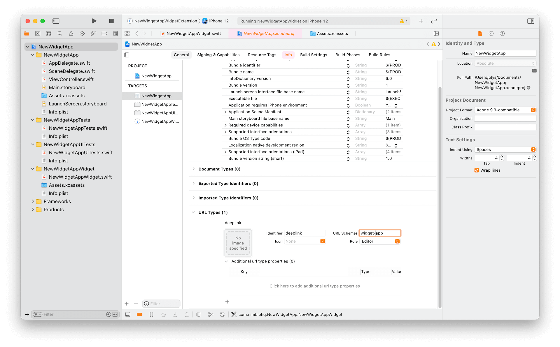
The default implementation of tapping Widget is launching the app. Widget also supports passing data from a certain view in the Widget to the main app with Deeplink.
To enable this capability, first, add a custom URL Types to the main target.
Then we can modify our ItemView with the following code:
struct ItemView: View {

    var item: ItemViewModel

    var body: some View {
        Link(destination: URL(string: "widget-app://\(item.id)")!) {
            Image(item.imageString)
                .resizable()
                .background(Color(UIColor.systemBackground))
                .cornerRadius(8.0)
                .shadow(
                    color: Color(UIColor.label).opacity(0.12),
                    radius: 20.0,
                    x: CGFloat(0.0),
                    y: CGFloat(4.0)
                )
        }
    }
}
If we are using AppDelegate we can implement application(_:open:options:), for SceneDelegate scene(_:openURLContexts:) and SwiftUI onOpenURL(perform:)
For example, we can print the URL of the Link
// SceneDelgate.swift

func scene(_ scene: UIScene, openURLContexts URLContexts: Set<UIOpenURLContext>) {
	print(URLContexts.first?.url.absoluteString)
}