
What is Composable Preview?
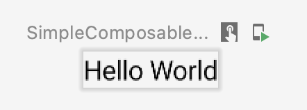
In Jetpack Compose, to create a Composable function that defines a UI component programmatically, we add the @Composable annotation to the function name.
@Composable
fun SimpleComposable() {
    Text("Hello World")
}
To preview the UI component that is being built, Jetpack Compose provides an annotation called @Preview. It visualizes the Composable code we implemented correspondingly:
@Preview
@Composable
fun SimpleComposablePreview() {
    SimpleComposable()
}
Preview Limitations
Although @Preview is easy to implement, it has some limitations. For instance, when combining Composable with ViewModel, Preview does not work well with the lifecycle-related component.
In case you are unfamiliar with ViewModel: it was introduced as a part of the Android App Architecture that aims to make the developer’s life easier when dealing with the android lifecycle. We can retrieve the data from ViewModel to present them on our Composables. We can also delegate functions that could be time-consuming or use heavy calculations (off the main thread) to ViewModel to avoid jamming the UI thread.
The key benefits of the ViewModel class are essentially twofold:
- It allows you to persist UI state.
- It provides access to business logic.
- Android developer official site
Come back to the aforementioned issue when combining Composable with a ViewModel, assuming that we use Hilt to inject the dependency:
@Composable
fun MyScreen(viewModel: MyViewModel = hiltViewModel()) { }

@Preview
@Composable
fun MyScreenPreview() {
    MyScreen()
}
Then on Android Studio, you will observe that the IDE complains with an error to Preview:
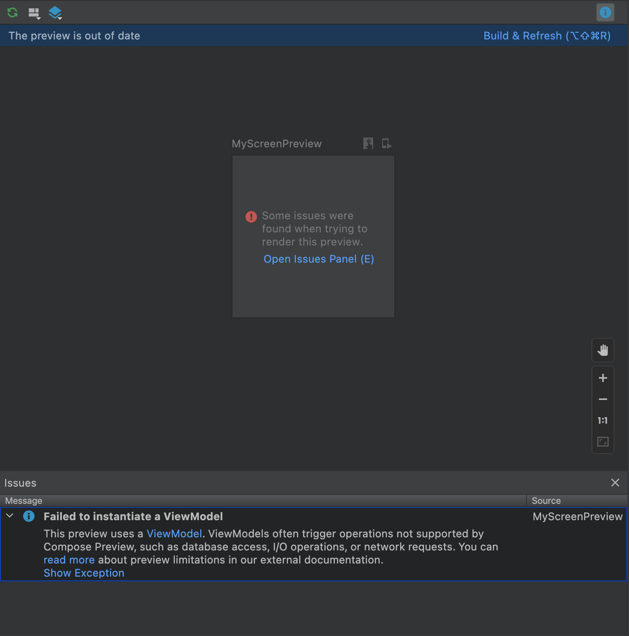
Apparently, from the error message, all database access, I/O operations, and network requests are not supported by Compose Preview.
So, the bold question is: how do we overcome this limitation?
Decoupling
The Motivation
As a newbie to Compose, when I started combining Compose with Dependency Injection or ViewModel, encountering errors like the above frustrated me.
It was like coding in the dark without being able to see what UI was being built and how it looked. I had to rerun the app after every line of code to check how it would display. It was counterproductive. Thus, I started searching for a way to ease that pain.
Solution
While searching for a solution to the Preview error, I stumbled upon this helpful information.
When your composable does not behave well in Preview, that is almost always an indication your composable is not sufficiently isolated from the rest of the platform/application code.
It turned out my code was not isolated enough from the rest of the platform and application codes. It also suggests
Roughly speaking, the idea is to push as much as possible toward the leaves of your code’s contribution to your composable hierarchy and have those leaves be purely rendering logic, or as close as you can manage.
The idea is simple enough: we need to decouple our main Composable component into child Composable functions so that they are isolated from the ones that the @Preview does not support.
State Hoisting
To decouple the screen contents of the Composable, we can use State Hoisting. From the Android official site’s definition:
State hoisting in Compose is a pattern of moving state to a composable’s caller to make a composable stateless.
The Screen Content
When you start implementing a screen, it is a good idea to separate the screen content into a separate Composable.
Here is the example from the Stateful versus Stateless section:
@Composable
fun HelloScreen() {
    var name by rememberSaveable { mutableStateOf("") }

    HelloContent(name = name, onNameChange = { name = it })
}

@Composable
fun HelloContent(name: String, onNameChange: (String) -> Unit) {
    Column(modifier = Modifier.padding(16.dp)) {
        Text(
            text = "Hello, $name",
            modifier = Modifier.padding(bottom = 8.dp),
            style = MaterialTheme.typography.h5
        )
        OutlinedTextField(
            value = name,
            onValueChange = onNameChange,
            label = { Text("Name") }
        )
    }
}
Notice that HelloContent Composable only requires simple arguments: a String name and a callback function onNameChange. Hence, creating a Preview of HelloContent is straightforward:
@Preview
@Composable
fun HelloContentPreview() {
    MyComposeTheme {
        HelloContent(name = "John", onNameChange = { /* Do Nothing */ })
    }
}
Now, let’s make another example. We will build a Composable that displays the (download) progress over time.
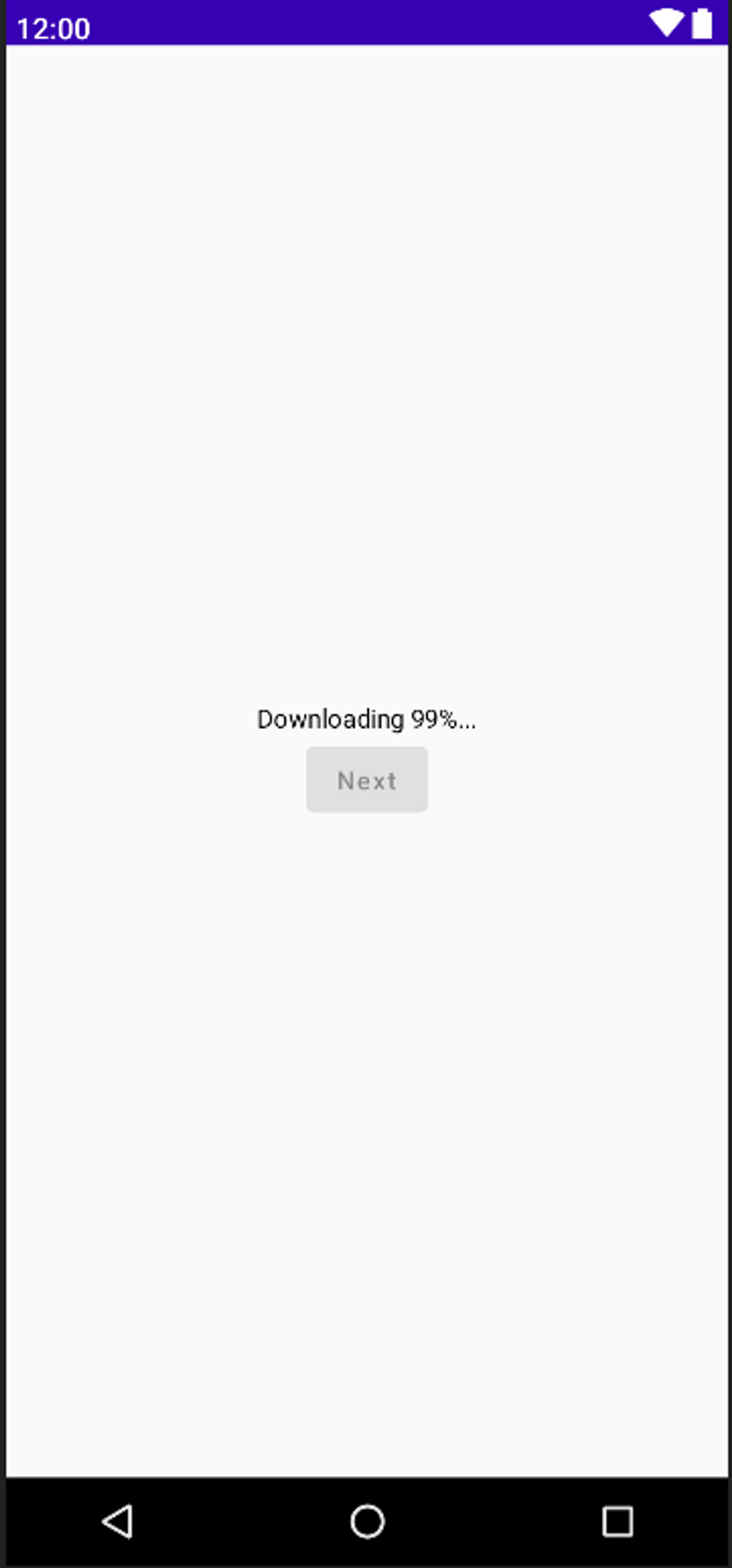
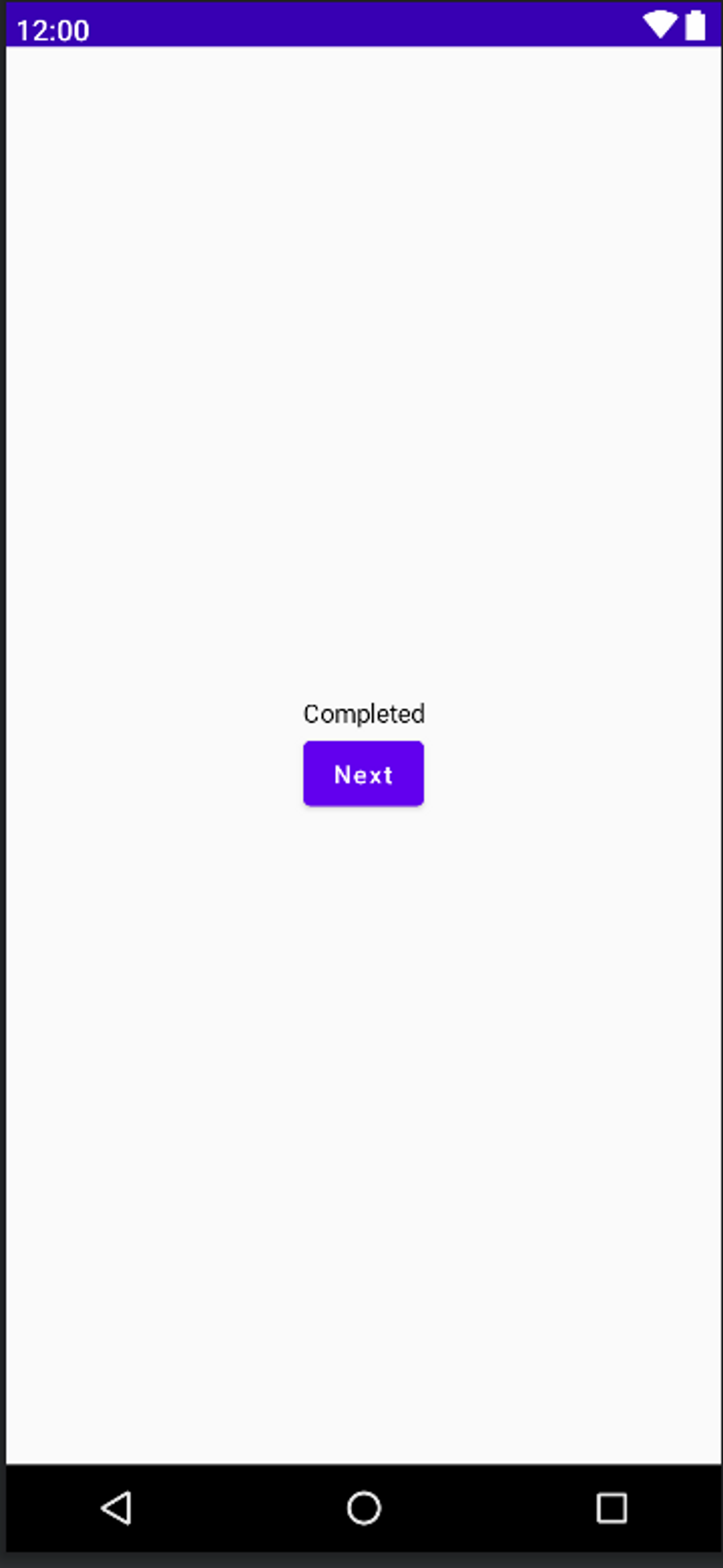
And when the progress reaches 100%, it shows Completed and the Next button will be enabled:
Supposing that the progress detail and the enable state of the Next button are managed by a ViewModel. Now, if we try to separate the Content like the above example, the implementation will look like this:
@Composable
fun MyScreen(viewModel: MyViewModel = hiltViewModel()) {
    val enableNext by viewModel.enableNext.collectAsState()
    val downloadPercent by viewModel.downloadPercent.collectAsState()

    MyScreenContent(
        downloadPercent = downloadPercent,
        enableNext = enableNext,
        modifier = Modifier.fillMaxSize()
    ) {
        viewModel.doSomething()
    }
}

@Composable
fun MyScreenContent(
    downloadPercent: Int,
    enableNext: Boolean,
    modifier: Modifier = Modifier,
    onClickNext: () -> Unit
) {
    Surface {
        Column(
            horizontalAlignment = Alignment.CenterHorizontally,
            verticalArrangement = Arrangement.Center,
            modifier = modifier
        ) {
            Text(
                text = if (downloadPercent < 100) {
                    "Downloading $downloadPercent%..."
                } else {
                    "Completed"
                }
            )
            Button(onClick = onClickNext, enabled = enableNext) {
                Text(text = "Next")
            }
        }
    }
}

@Preview(showBackground = true, showSystemUi = true)
@Composable
fun MyScreenPreview() {
    MyComposeTheme {
        MyScreenContent(
          downloadPercent = 99,
          enableNext = true) { /* Do Nothing */ }
    }
}
Observation:
- Instead of implementing the progress detail text and the
Nextbutton (along with its behavior) to theMyScreenComposable, we have separated it intoMyScreenContent - The
MyScreenContentdoes not have any dependency on ViewModel; it also only requires simple arguments:
@Composable
fun MyScreenContent(
    downloadPercent: Int,
    enableNext: Boolean,
    modifier: Modifier = Modifier,
    onClickNext: () -> Unit
) { }
Hence, we can make a Preview of MyScreenContent easily ✅.
There is no more ViewModel initializing error, and we can see what we are building:
@Preview(showBackground = true, showSystemUi = true)
@Composable
fun MyScreenPreview() {
    MyComposeTheme {
        MyScreenContent(
          downloadPercent = 99,
          enableNext = false) { /* Do Nothing */ }
    }
}
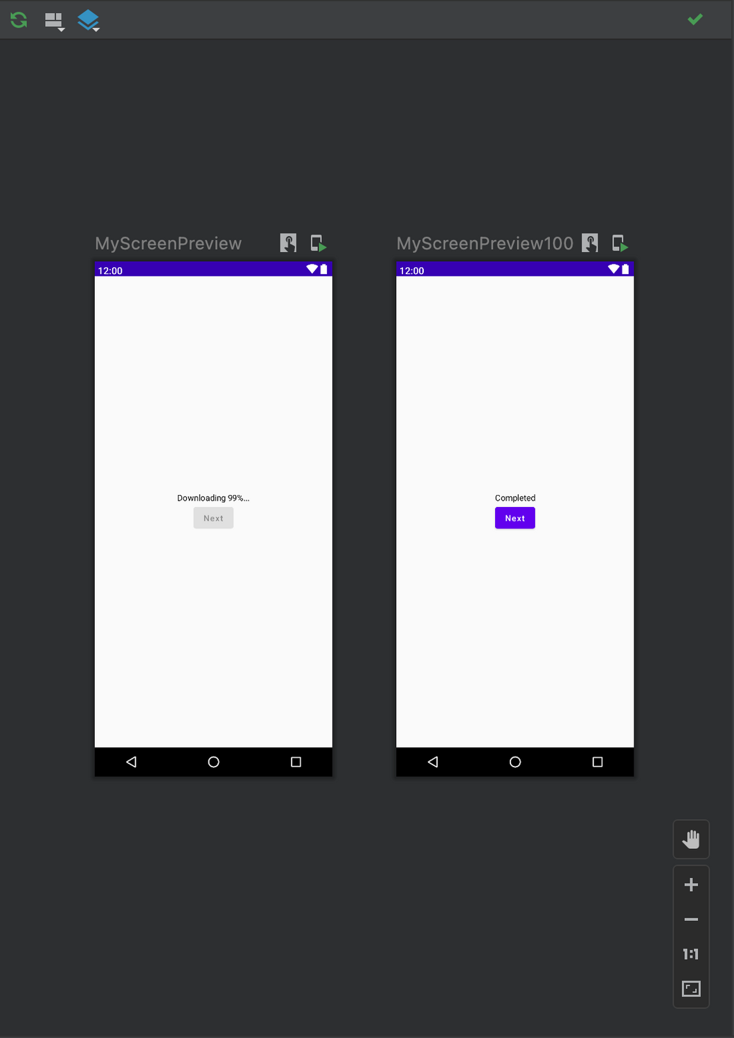
We can also Preview different states, say when the progress is 100%, and the Next button is enabled:
@Preview(showBackground = true, showSystemUi = true)
@Composable
fun MyScreenPreview() {
    MyComposeTheme {
        MyScreenContent(
          downloadPercent = 100,
          enableNext = true) { /* Do Nothing */ }
    }
}
And the Preview result will display accordingly:
This is just a simple UI example. In a real-world implementation, there could be many other states like:
- Show loading while fetching data from the network or local databases;
- Show error when something got wrong;
- Show data when fetching is a success;
- and many other custom logics…
on a single screen. By separating the content for Preview, you can still manage to preview each Composable during the developing time.
Also, in these examples, we passed only simple data and primitive type (String, Boolean, Int, etc.), but it could be applied to a customized data model and more complicated ones too.
ViewModel as State holder
As mentioned above, in a real-world application, a Composable may have to handle more complex data that is propagated from a ViewModel. You wouldn’t want to overwhelm your Composable function declaration with too many arguments, would you? 😅 To handle those cases, we can consider structuring the Composable data in a UiState, deriving them from the ViewModel.
Why use a UiState holder?
The Android developer site states this:
When a composable contains complex UI logic that involves multiple UI elements’ state, it should delegate that responsibility to state holders. This makes this logic more testable in isolation and reduces the composable’s complexity.
An example of ViewModel UiState would be
data class ExampleUiState(
    val dataToDisplayOnScreen: List<Example> = emptyList(),
    val userMessages: List<Message> = emptyList(),
    val loading: Boolean = false
)
Now let’s create the UiState for our Download Progress example:
// MyViewModel
class MyViewModel : ViewModel() {
    private val _myScreenUiState = MutableStateFlow(MyScreenUiState())
    val myScreenUiState = _myScreenUiState.asStateFlow()

    fun doSomething() {
        // Do some expensive calculation
    }
}

// MyScreenUiState
data class MyScreenUiState(
    val downloadPercent: Int =  0,
    val enableNext: Boolean = false
)

// MyScreen
@Composable
fun MyScreen(viewModel: MyViewModel = hiltViewModel()) {
    val screenUiState by viewModel.myScreenUiState.collectAsState()

    MyScreenContent(
        downloadPercent = screenUiState.downloadPercent,
        enableNext = screenUiState.enableNext,
        modifier = Modifier.fillMaxSize()
    ) {
        viewModel.doSomething()
    }
}
...
💡 You can keep everything you expose between your
ViewModeland yourComposableinside yourUiState.
A more comprehensive way to preview multiple states?
There could be more than one UI state for a screen, and previewing them would require more than one Preview function. So, when using UiState as a source of truth for our Composable state, we can now use PreviewParameterProvider for various states of our Composable component.
Introducing PreviewParameterProvider
We will use PreviewParameterProvider to provide sample data for our Composables.
To begin with, let’s create MyScreenUiStatePreviewParameterProvider with 2 states: when the progress is 99%, the other is when it reaches 100%, and the Next button is enabled.
class MyScreenUiStatePreviewParameterProvider : PreviewParameterProvider<MyScreenUiState> {
    override val values = sequenceOf(
        MyScreenUiState(downloadPercent = 99),
        MyScreenUiState(downloadPercent = 100, enableNext = true)
    )
}
PreviewParameterProvider provides a list of UiState, and we can get the data required for the preview from it with @PreviewParameter annotation.
Let’s replace our old Preview functions with the following code. Notice that we no longer need multiple Preview functions for every state.
@Preview(showBackground = true, showSystemUi = true)
@Composable
fun MyScreenPreview(
    @PreviewParameter(MyScreenUiStatePreviewParameterProvider::class) myScreenUiState: MyScreenUiState
) {
    MyComposeTheme {
        MyScreenContent(
            downloadPercent = myScreenUiState.downloadPercent,
            enableNext = myScreenUiState.enableNext
        ) {
            // Do Nothing
        }
    }
}
You can see the result is the same as before, but now we can preview all the states with only one Preview function 🤩.
What if we want to add a new logic that will show “Starting download” if the percentage is 0% and we want to keep a Preview of that new state? Simply update the logic and include a new UiState to our MyScreenUiStatePreviewParameterProvider:
// MyScreenContent
@Composable
fun MyScreenContent(
    downloadPercent: Int,
    enableNext: Boolean,
    modifier: Modifier = Modifier,
    onClickNext: () -> Unit
) {
    Surface {
        Column(
            horizontalAlignment = Alignment.CenterHorizontally,
            verticalArrangement = Arrangement.Center,
            modifier = modifier
        ) {
            Text(
                text = when {
                    downloadPercent == 0 -> "Starting download"
                    downloadPercent < 100 -> "Downloading $downloadPercent%..."
                    else -> "Completed"
                }
            )
            Button(onClick = onClickNext, enabled = enableNext) {
                Text(text = "Next")
            }
        }
    }
}

// MyScreenUiStatePreviewParameterProvider
class MyScreenUiStatePreviewParameterProvider : PreviewParameterProvider<MyScreenUiState> {
    override val values = sequenceOf(
        MyScreenUiState(downloadPercent = 0),
        MyScreenUiState(downloadPercent = 99),
        MyScreenUiState(downloadPercent = 100, enableNext = true)
    )
}
And the Preview result will be
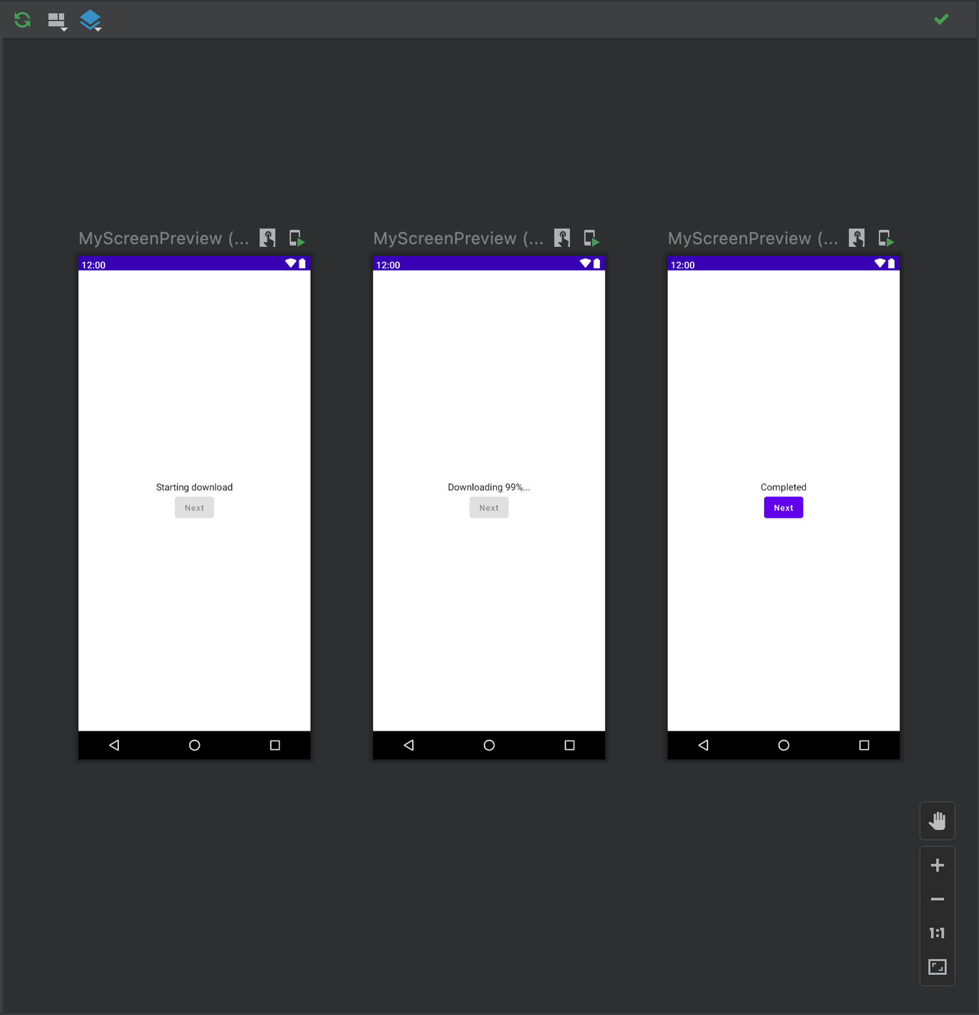
With a single Preview function, we can now see all the states of our screen.
Now for the final stretch 🙋: How will it be in dark mode?
Multipreview Annotations
Jetpack Compose has a feature called Multipreview Annotations. Here is what it does:
With multipreview, you can define an annotation class that itself has multiple
@Previewannotations with different configurations. Adding this annotation to a composable function will automatically render all the different previews at once.
We will apply Multipreview to preview both Night/Dark mode displays for our Composable.
First, let’s create a new annotation DayNightPreviews for our screen:
@Preview(
    name = "Day theme",
    showSystemUi = true,
    showBackground = true,
    uiMode = UI_MODE_NIGHT_NO
)
@Preview(
    name = "Night theme",
    showSystemUi = true,
    showBackground = true,
    uiMode = UI_MODE_NIGHT_YES
)
annotation class DayNightPreviews
Then, we will replace our @Preview with our newly created @DayNightPreviews.
Notice that as soon as we change the annotation, you will see the preview screens rebuilding immediately.
@DayNightPreviews
@Composable
fun MyScreenPreview(
    @PreviewParameter(MyScreenUiStatePreviewParameterProvider::class) myScreenUiState: MyScreenUiState
) {
    ...
}
The preview result:
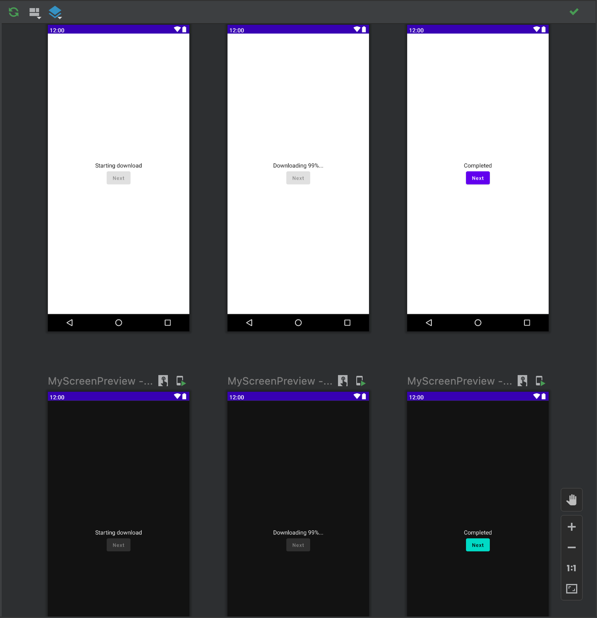
Not the best UI/UX…. I know 😬. But now we can render 6 screens of UI states with only one Preview. And the cool thing is, you can reuse them in other Composables, too 🥳.
Conclusion
Compose can make a developer’s life easier with Declarative UI. It is a lot nicer and cleaner. We can still observe what we are building programmatically and how it looks during development.
With customizable Preview, you can see different states of your screen and even interact with them using Interactive Mode.
You can edit the configurations or logic and then present to your client what it will look like without running the application with various states. To recap, what you will need are:
- Decouple your Composables as much as you can
- Use State Holders for managing screen states
- Use PreviewParameterProvider for multiple @Preview(s)
- Use Multipreview Annotations for different configurations